
Building A Good Cryptocurrency Model Is Harder Than You Think
By Daniel Chen, Founder at OpenToken, lead engineer at Andreessen Horowitz, Caltech Computer Science, Economics
As cryptocurrencies have exploded in value, so too have the attempts tounderstand them. Even more exciting is a recent uptick in quantitativeanalysis. Spreadsheet models have risen in popularity as a tool for evaluating and predicting trends.
The effort and analytic rigor behind these models is phenomenal. However, there are strong reasons why most top funds do not use this as part of their evaluation methodology. Often, there is no objective measure — what am I trying to predict, price in 1 week? 1 year? 10 years? And the feature set is often not very predictive (are we really so sure that the number of Telegram users is a strong indicator of future price?). In this space, it’s all too easy to fall into the trap of cargo cult analysis: building complex models that are not all that predictive once the assumptions and objectives are stated and the model is tested.
To illustrate my point, I’ll walk through an example on an existing dataset and finish with my own take on token sale evaluation. All that’s required to follow along is a bit of basic statistics. I’ll post the code at the end of the article.
Crunching the numbers
For the sake of example, let’s use the following spreadsheet which has the benefit of being very detailed and complete (a godsend for anyone playing around with data). It tracks quite a few interesting metrics that intuitively seem very predictive: codebase activity (Github contributors/commits), community activity (Reddit/Telegram members), exchange listings, and public presence (tweets, news mentions). Most people I talk to use some combination of these as a major part of their decision process.

We can write some quick code to read the CSV and dump it into a useful format: a grid of numbers across the feature space (our input matrix) and a list of numbers that we want to “predict” (more specifically, check for correlations). Before we do any number-crunching, there’s an important observation to make. There are 51 rows and 21 columns: a ton of data for a lowly human to process. But, to draw useful conclusions, you typically need much more data than this. Models that I’ve run in the past have been trained on at least tens of thousands of samples. ImageNet, the go-to database for training computer vision algorithms, has over 14 million images!
The main issue with our dataset is something known as dimensionality. In a spreadsheet, this can be be seen as the number of rows in the spreadsheet versus the number of columns. What we’re looking for is something that looks long and thin — a ton of rows but just a few columns. The Netflix Challengedataset famously has over 1.4 million rows but only three columns (user, movie, and rating).
The more complex the model (the more columns we have), the more samples we need for the data to generalize (the more rows we need to add so we can still trust our results). Without going into more detail, the rule of thumb I’ve internalized is that you need at least ten times the rows as you have columns. So, the next time you see someone making a model out of a square spreadsheet (dimensionality about the same as the sample size), you can be a bit more skeptical of the conclusions they draw.
Back to our example. 51 rows of data is fine, but to keep things simple (and statistically significant), let’s start with checking correlations between pairs of data (a bivariate regression).
Looking at the data
The following section has some numbers and graphs. If that’s not really your thing, feel free to skip to the next section, “Ok, so what model should I use?”
So we run the regression and it looks something like this:
Total # Commits vs Market Cap R^2: 0.138249
Total # Contributors vs Market Cap R^2: 0.130249
One Month # Commits vs Market Cap R^2: 0.002144
One Month # Contributors vs Market Cap R^2: 0.091301
Telegram Members in Top Group vs Market Cap R^2: 0.159053
Reddit Members vs Market Cap R^2: 0.806415
Exchanges Listed vs Market Cap R^2: 0.298320
# of Top 5 Exchanges vs Market Cap R^2: 0.150254
# of Hashtag Tweets (30 days) vs Market Cap R^2: 0.368655
# of News Mentions (30 days) vs Market Cap R^2: 0.771270
Twitter Followers vs Market Cap R^2: 0.443522
For those of you unsure how to interpret this, the numbers to the right are the coefficients of determination of the best fit line. As long as our data satisfy certain properties, we can be sure that the line is our best possible guess of a correlation.
Let’s take some examples. “Total # Commits” and “Market Cap” have an R² of 0.138249. That ends up looking something like this:
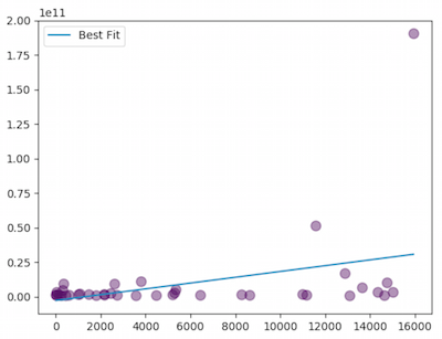
Probably not too useful. We’re looking for something that looks a little more like this:
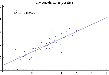
The closer R² is to 1, the stronger the correlation. Fortunately, our results have some strong contenders: “Reddit Members vs Market Cap” at 0.81 and “# of News Mentions (30 days) vs Market Cap” at 0.77. Let’s take a look at one of those graphs, “Reddit Members vs Market Cap”:

Oh no — even though the R² is pretty high, the graph doesn’t look like the one we’re expecting. That’s because the data suffer from something known as heteroskedasticity — where the points kind of fan out as the numbers get larger. This is something we see often in venture capital data because the sizes of companies grow by orders of magnitude, and with larger companies come larger variances. Fortunately, there’s a very easy fix: normalize the data on a logarithmic scale. Now, the plot looks much more correlative:

Total # Commits vs Market Cap R^2: 0.083247
Total # Contributors vs Market Cap R^2: 0.094291
One Month # Commits vs Market Cap R^2: 0.091181
One Month # Contributors vs Market Cap R^2: 0.151921
Telegram Members in Top Group vs Market Cap R^2: 0.130186
Reddit Members vs Market Cap R^2: 0.357688
Exchanges Listed vs Market Cap R^2: 0.303370
# of Top 5 Exchanges vs Market Cap R^2: 0.395840
# of Hashtag Tweets (30 days) vs Market Cap R^2: 0.426500
# of News Mentions (30 days) vs Market Cap R^2: 0.484609
Twitter Followers vs Market Cap R^2: 0.353295
The correlations took a hit: the R² of “Reddit Members vs Market Cap” is down from 0.81 to 0.36. But these values aren’t bad. At the risk of offending the Bayesian readers, a more precise evaluation of how “not bad” these values are is to perform a hypothesis test on the coefficients of the regressors. Without going into too much detail, the idea is to compare your model against a model that assumes no relationship (just a horizontal line). If there is enough evidence to show that adding “Reddit Members” significantly improves the model, we can, with confidence, say there is some relationship.
The formal measure of this is the p-value derived from the F-statistic, which represents the likelihood our data would’ve been generated purely by random chance — that is, if there were no actual relationship between “Reddit Members” and “Market Cap”. Put another way, if the p-value is very small, there’s almost no chance that the data we’re looking at could’ve been randomly generated. There must be some relationship.
Most academic studies look for p-values less than either 0.05 or 0.01. In fact, the p-values we get hover around numbers very close to zero. It seems that the popularity of a cryptocurrency might be nontrivially related to its market cap after all (imagine that)! Though it seems that developer activity is a bit less useful.
Total # Commits vs Market Cap p-value: 0.074861
Total # Contributors vs Market Cap p-value: 0.057240
One Month # Commits vs Market Cap p-value: 0.061724
One Month # Contributors vs Market Cap p-value: 0.014175
Telegram Members in Top Group vs Market Cap p-value: 0.009292
Reddit Members vs Market Cap p-value: 0.000004
Exchanges Listed vs Market Cap p-value: 0.000028
# of Top 5 Exchanges vs Market Cap p-value: 0.000001
# of Hashtag Tweets (30 days) vs Market Cap p-value: 0.000000
# of News Mentions (30 days) vs Market Cap p-value: 0.000000
Twitter Followers vs Market Cap p-value: 0.000007
But think about this for a second. All these p-values mean is that you can perhaps eyeball a general trend of dots moving up and to the right in the plots. How does this inform which cryptocurrencies you should buy? Do you buy the currencies at the top right — the ones with the most Reddit members and highest market caps? Do you buy all currencies above the trend line because their market caps are proportionally higher per additional Reddit member?
We’ve talked ad nauseam about correlations — the relationships between variables. But, it turns out that prediction is an entirely different problem. This is where the question of correlation vs. causation comes in: does being in the news lead to a higher market cap, or does a higher market cap lead to more news coverage (or both)?
We can do a pretty quick sanity check. Instead of comparing these factors to market cap, we can instead compare them to the change in market cap since the spreadsheet was made. When running the code over the new data (current as of 2/13/2018), the plots no longer look so meaningful.

Removing the outliers makes the randomness even more apparent.

Now, the implied correlation is negative! More Reddit users apparently leads to decreases in market cap. We can blame this more on fitting noisy data rather than any negative relationship, as evidenced by the final set of p-values.
Total # Commits vs Market Cap Change p-value: 0.839070
Total # Contributors vs Market Cap Change p-value: 0.709478
One Month # Commits vs Market Cap Change p-value: 0.227949
One Month # Contributors vs Market Cap Change p-value: 0.615143
Telegram Members in Top Group vs Market Cap Change p-value: 0.019781
Reddit Members vs Market Cap Change p-value: 0.810512
Exchanges Listed vs Market Cap Change p-value: 0.311267
# of Top 5 Exchanges vs Market Cap Change p-value: 0.512172
# of Hashtag Tweets (30 days) vs Market Cap Change p-value: 0.930046
# of News Mentions (30 days) vs Market Cap Change p-value: 0.698512
Twitter Followers vs Market Cap Change p-value: 0.821432
Most of these values are well outside our tolerance of statistical significance and are more or less entirely random. Interestingly enough, for the one feature that might be related, “Telegram Members”, the correlation is negative, which implies more Telegram members relates to a decrease in price. But, I wouldn’t read so much into that. The only conclusion I’d draw is that the data we have do not predict what we expect.
Ok, so what model should I use?
So what does this mean? Can we definitively say the number of Reddit or Telegram members has no predictive power? Unfortunately not. There’s nothing ruling out better models or correlations that come out of larger and more comprehensive datasets. For example, try using “change in Telegram members” as a regressor, using a more expressive model, or framing the problem as a classification problem. The point I’m making is that, with the current dataset, it’s hard to imagine a truly predictive model without some change.
The larger point is this: if you construct a model, start with a formalization of your objective and assumptions. Make sure it’s testable and, more importantly, verifiable/falsifiable. If it works — fantastic, you now have an edge! If not, back to the drawing board.
Often, when predicting future prices of an asset, you’re probably looking forautocorrelations. There is an entire body of economic work devoted to proving that these might exist as well as another body of work devoted to disproving it. In public equities markets, it’s commonly believed that prices follow a random walk or, more specifically, a martingale (or not?). That is, the expected change in stock price is not influenced by the previous prices. This is the source of the commonly held belief that the stock market is impossible to predict. According to some of my quant fund friends, there is reason to believe that this might not hold true just yet in cryptocurrency markets. Perhaps there are predictive signals of future price movements (past price, social media activity, etc.), but the results are yet unpublished. At best, this requires more analysis.
So what did we learn? A few things:
- The data that we might believe are meaningful are probably less than we think.
- It’s easy to fool ourselves into thinking we have a good strategy or model. Often times, we look for patterns that aren’t really there. This can be avoided with good ol’ data analysis.
- Quantitative analysis is hard to get right. Correlations are an important first step. But there is a much larger body of work around what we’re really trying to do: predict future price.
As promised, here’s a link to the code. Feel free to play around with it on your own, and let me know if you find any bugs: https://github.com/opentoken-inc/crypto-dd