Steve Ballmer Spends Millions To Redesign Government Information
By Mark Wilson for Co.Design
The former Microsoft CEO and current Clippers owner wants to give back through a powerful data visualization tool.


What does the average teacher make? How much does the U.S. spend on defense? Is crime going up or down–and how does that correlate with the police we employ and criminals we incarcerate?
I pay taxes; where does my money go?
These are the questions that USAFacts hopes it can answer, as simply and easily as using Google search. It’s a new site bankrolled by The Ballmer Group, the charitable enterprise of former Microsoft CEO Steve Ballmer, who, with an estimated net worth of billions, is one of the richest people in the world.

Everyone has heard of the Census bureau, but there are actually 60 different government agencies that collect data on the American people, and the use of their tax dollars. Thanks largely to initiatives by President Obama, this information is more open than ever before. The problem is, these government agencies don’t work all that well together, so open data isn’t necessarily accessible data. And accessible data isn’t necessarily legible data.
“When I retired three years ago, my wife, who’d been involved in our philanthropic stuff for eight or nine years by then, she said, ‘Okay, it’s time for you to get involved.’ And primarily it had been for kids who grew up in highly disadvantaged situations,” Ballmer recounts. “And my first response was ‘Hey, government helps with this. Government takes care of these kids. Are you sure this is the way we want to go?’
“She said, ‘C’mon, we can do this.’ I said ‘Okay, I really want to understand the numbers.’ It turns out a good deal of the social services sector and many of the government programs do feed those kids, but numbers were my way to understand. It was hard to get the numbers.”
What Ballmer imagined was a 10-K for the government–a document all high-earning U.S. businesses are required to file that broke down spending.

So he built a team that began organizing every bit of this information they could find to become a non-partisan, easily referenced, pile of numbers. His staff needed a way to organize the data they were bringing in–one that could report numbers like gun violence without taking any particular stance–so they decided on a container that all Americans should be able to agree upon: The four main buckets referenced in America’s original mission statement, the preamble of the Constitution.
- Establish justice and ensure domestic tranquility
- Provide for the common defense
- Promote the general welfare, and
- Secure the blessings of liberty to ourselves and our posterity.
The Ballmer Group team was pleasantly surprised that each new piece of data they found could easily be housed into one of those four pillars–which is, in a sense, proof that the spending America has been doing supports these original tenets (even if many people would disagree upon the proportions thereof).
But after building a monstrous Excel doc, and an even more monstrous, 385-page PowerPoint from all this data, they needed a partner to turn it into something consumable: a website.
That website launches today at USAFacts.org, the result of about 5 months of work from design partner Artefact. Artefact understood that the site had to be trustable. It had to be compelling for people with short attention spans. But most of all? It had to be nonpartisan–a true, fact-based enterprise that didn’t take sides on issues.
“It’s not like other prominent data visualizations about government that are inherently storytelling, interpreting information graphics that building a point of view or explanation of something,” says Dave McColgin, Insights and Strategy Director at Artefact. “Explanations are deliberately absent from the site.”
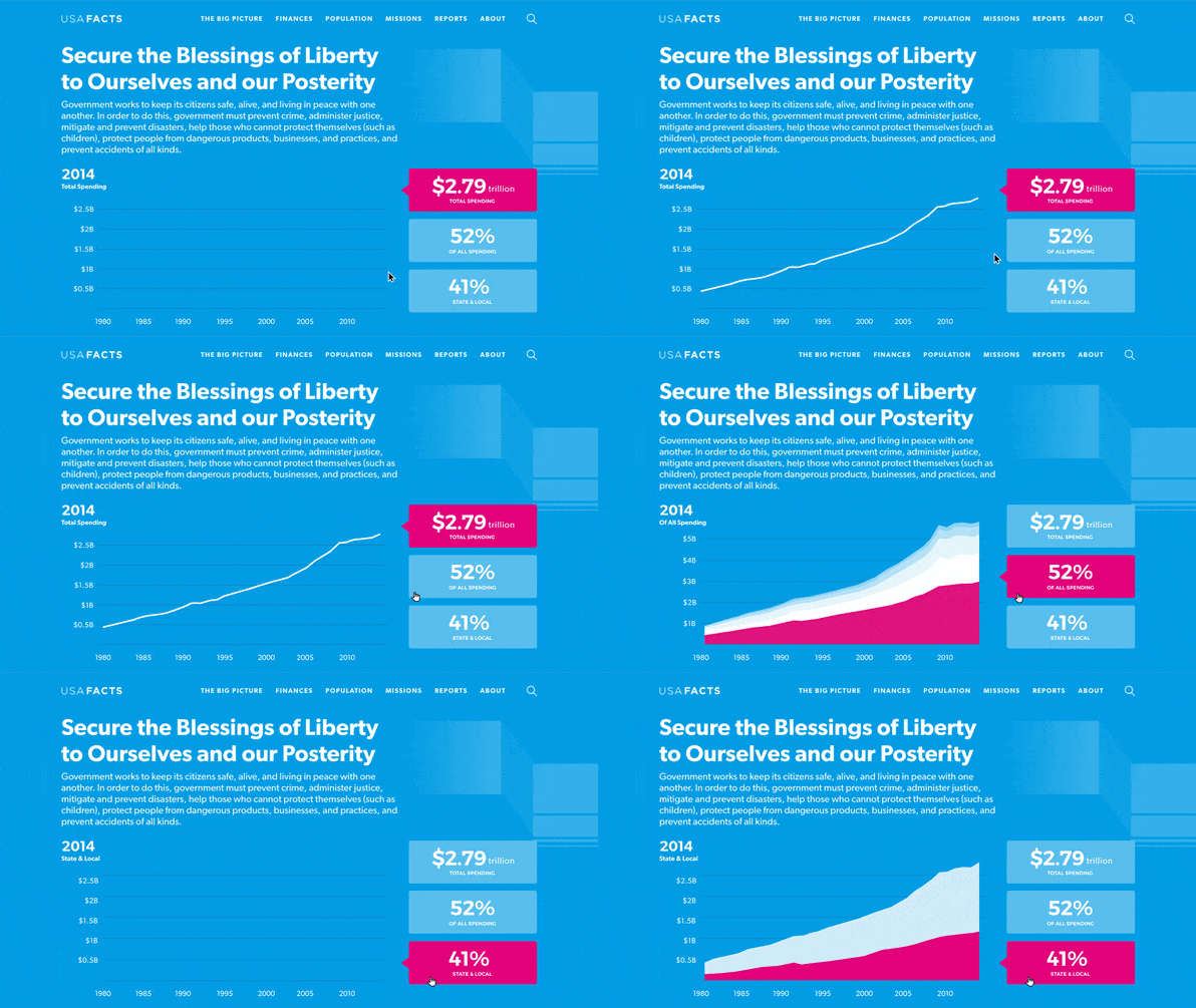
The site greets you with a search bar, behind which you’ll spot a giant electric blue/magenta sankey diagram. The colors don’t represent Democrats and Republicans, but revenue and spending. On the left, you can drill down to see how the U.S. makes its money. On the right, you can see how those funds are allotted out across programs. And as with the entire site, if you’re interested, you can just click in to get more specific information–complete with linked citations as to where this government data came from.
“A big part of the trust is leaning on data from government sources that generate the data, and [demonstrating] that we didn’t manipulate it. Anywhere you end up…there’s always a sources button. You’ll see the authoritative original agency, and a link to the sources of that agency–sometimes a survey, a subset [of data].”
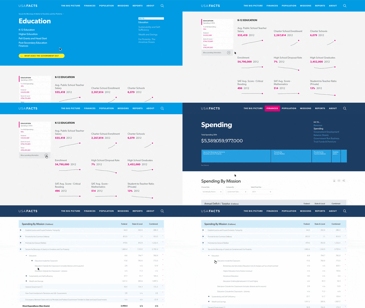
As you drill down, the data becomes more topically inspired than Constitutional. You can end up on a page about education, or crime, which is populated entirely by sparklines–spartan, mini line graphs imagined by Edward Tufte that demonstrate trends rather than offer data overload. What’s remarkable is that USAFacts organizes many potentially related data trends onto a single page. You can look at the topic of crime, and see rates of violent crime next to the number of people incarcerated and the number of officers employed.

Could this sort of organization create a false sense of correlation equals causation? Perhaps, McColgin admitted. But the greater feat is simply offering a citizen, member of the media, or politician the access to make such a mistake in the first place. As Ballmer explains, it behooves no single agency in the government to put all of this government data together in a single spot, so legibly.
“Government is a funny thing. There’s share of responsibility, divided authority, and weak alignment across city, state, county, federal,” Ballmer says. “So there isn’t a lot of ability to come together in a coherent way, partly because there’s, quote, ‘nobody in charge of bringing things together.’ I think government should do that. In a perfect world, the government should do the sort of stuff we’re trying to do, even if they do it a little bit differently.”
USAFacts may have just launched, but it’s far from complete. Over time, the team will add more analytic tools, and they’ll be forced to constantly update the information, too–especially given how much the Trump administration is changing federal budgets. As for those facts inside USAFacts, they may find a way to break out of the site itself–Ballmer Group is currently in discussions with Microsoft to surface the database’s data in Bing search.
In today’s political climate, perhaps it’s not a bad idea to bypass the press and just inject the best information into search engines. Much of the U.S. distrusts the media, and those inclined to fact check things for themselves need a third party source to do so.
Ballmer hopes that with a commitment to invest a few million dollars a year into the initiative, USAFacts won’t simply be a compendium for information, but a way to spur fact-based dialog in an ever-more partisan political climate.
“The other thing which I think would be fun to do and we’re looking at is how would we create a platform in which somebody from the right and somebody from the left could have a point-counterpoint, but using the same data,” Ballmer says. “And our role would be to convene those and insist on the use of common data published by the government, but then have people tell both narratives in the context of, let me call it, real facts. We could do it on the site, we could do it in a video context online, a variety of different places. We’re thinking it through now.”


